The brief
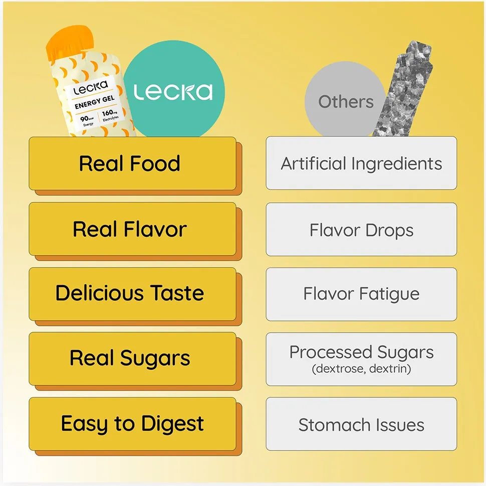
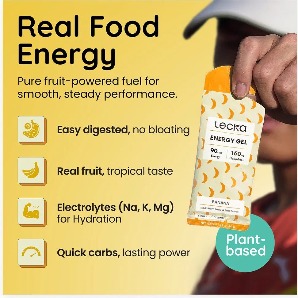
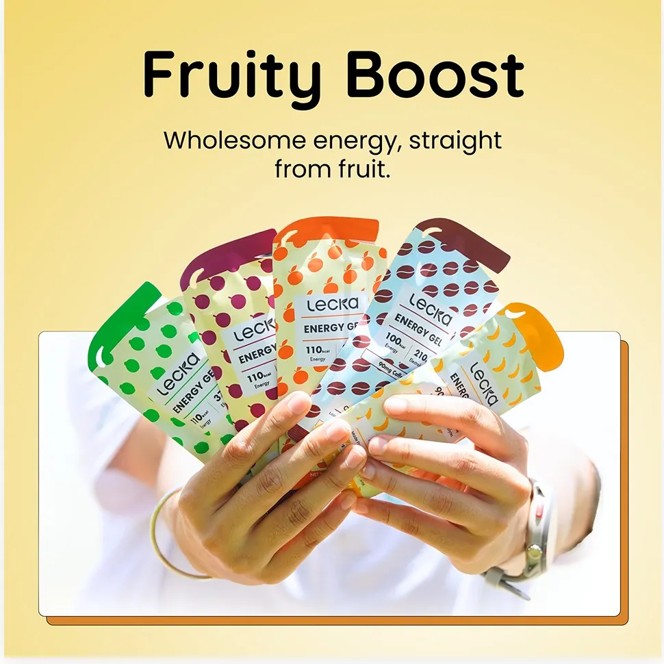
Lecka makes energy gels from real fruit. Most gels in the category look like lab products: shiny pouches, numbers, and very little about taste or digestion. Endurance athletes already know the downside of those gels, from flavour fatigue to stomach trouble.
The job was to make Lecka read as food first and fuel second, and to answer the doubts an athlete has before switching gels.
The approach
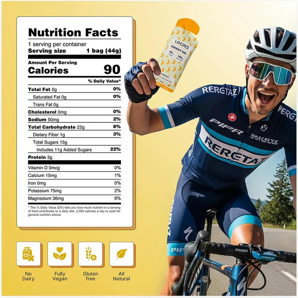
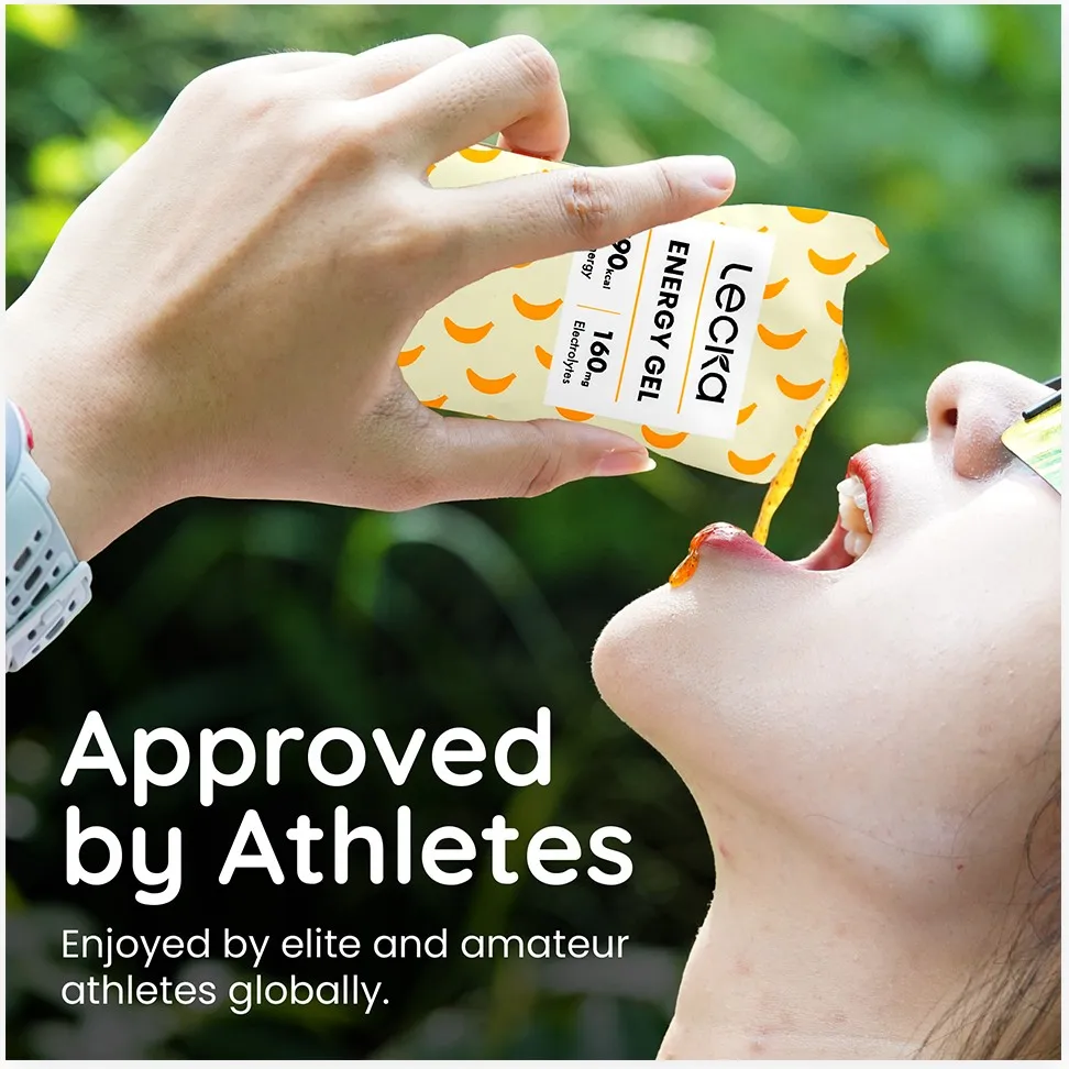
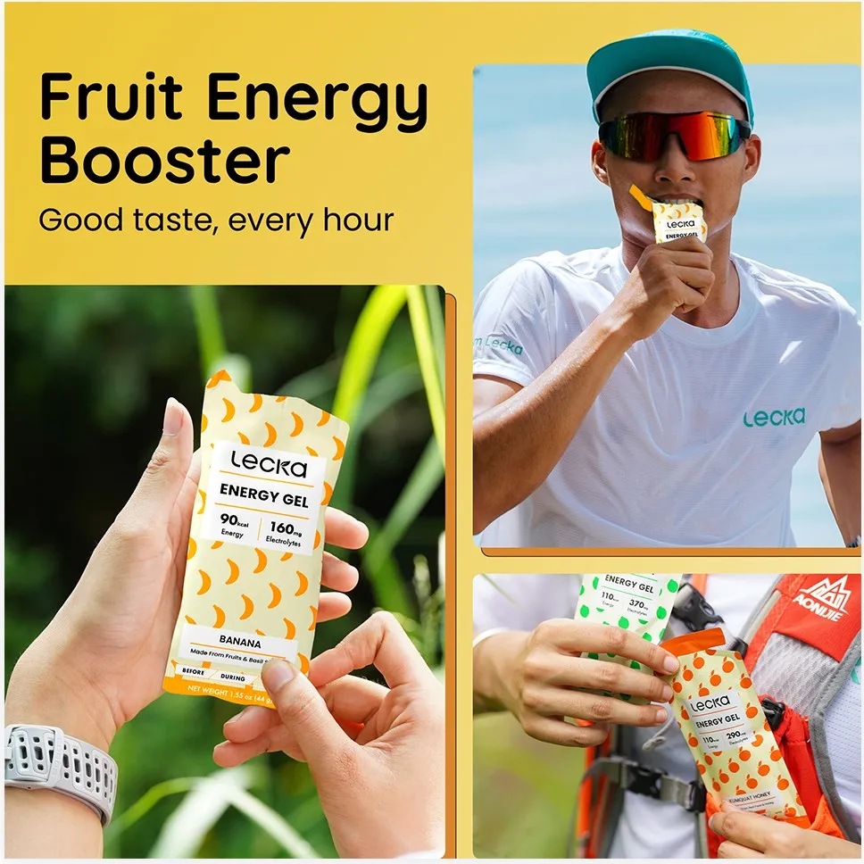
Every image carries one message. The sequence follows the buyer’s questions in order: what is it, why is it different, is it for me, can I trust what’s inside, and how do I use it.
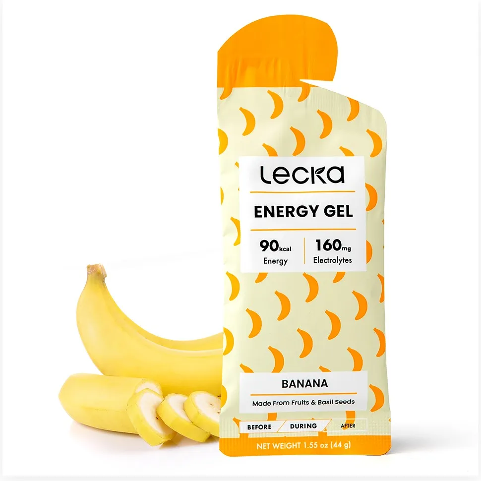
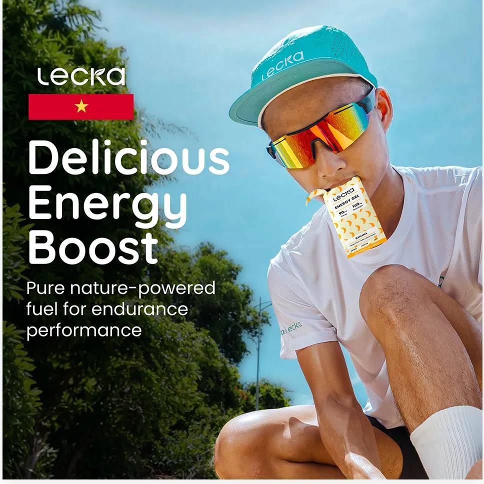
The palette comes straight from the product: banana yellow and gel gold from the pouch, the orange of the cap, and Lecka’s teal for small highlights. Photography stays real and in the moment, so the brand feels human instead of clinical.