Amazon A+ Content image sizes, every module.
The sizes I design to every day, taken from Amazon's own A+ Content documentation. They are minimum sizes, so exporting at exactly these (or 2x) keeps text sharp.
Standard modules: 970 px wide
Full-width hero with a headline. Your first impression.
Wide banner with a text box on top of the image.
Logo only. Keep it simple and sharp.
One square image beside a headline and text.
Square image with text and a bullet list.
Square image, text and a specs block.
Tall main image, text, and a small sidebar image.
Three squares in a row, text under each.
Four small images in a row, text under each.
Small images in a 2 x 2 grid, text beside each.
Main image with clickable thumbnails and captions.
Up to 6 product columns, rows of features under them.
No image. Headline and body text, or a specs table.
Pink = your image, grey = text Amazon renders. Sizes are Amazon's minimums, checked 2026-11-05.
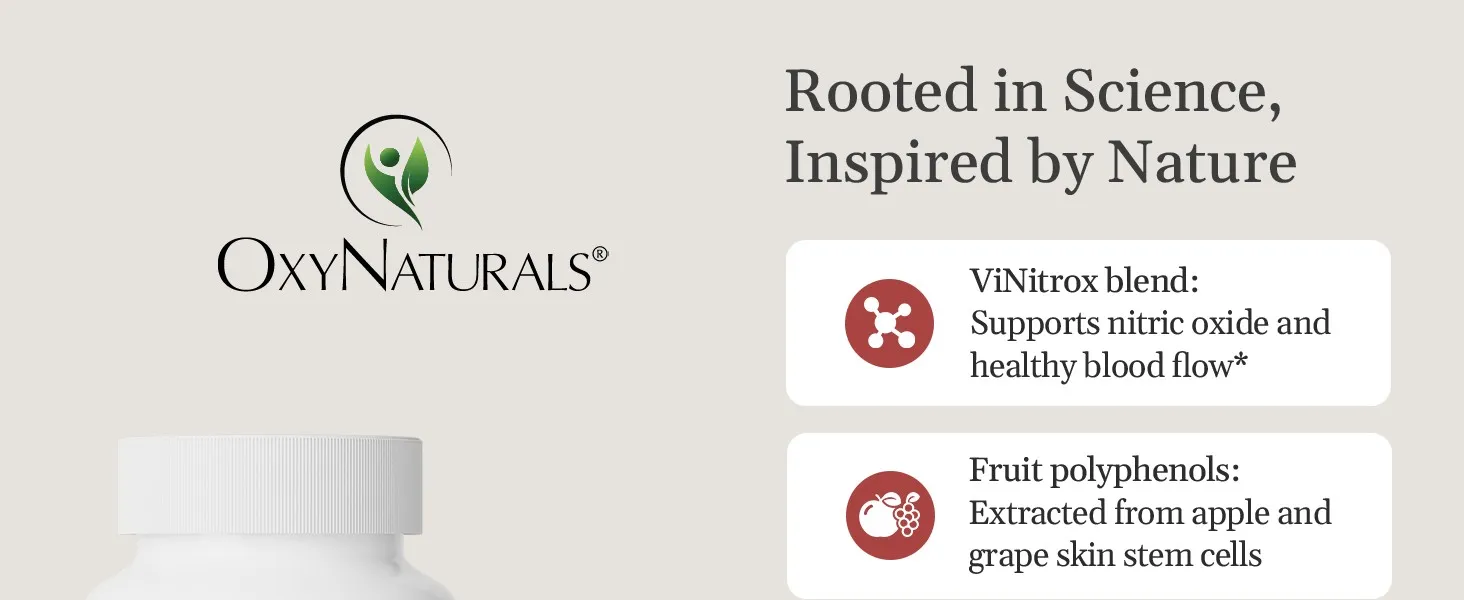
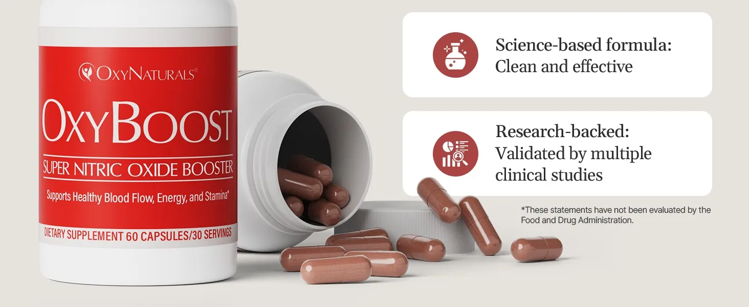
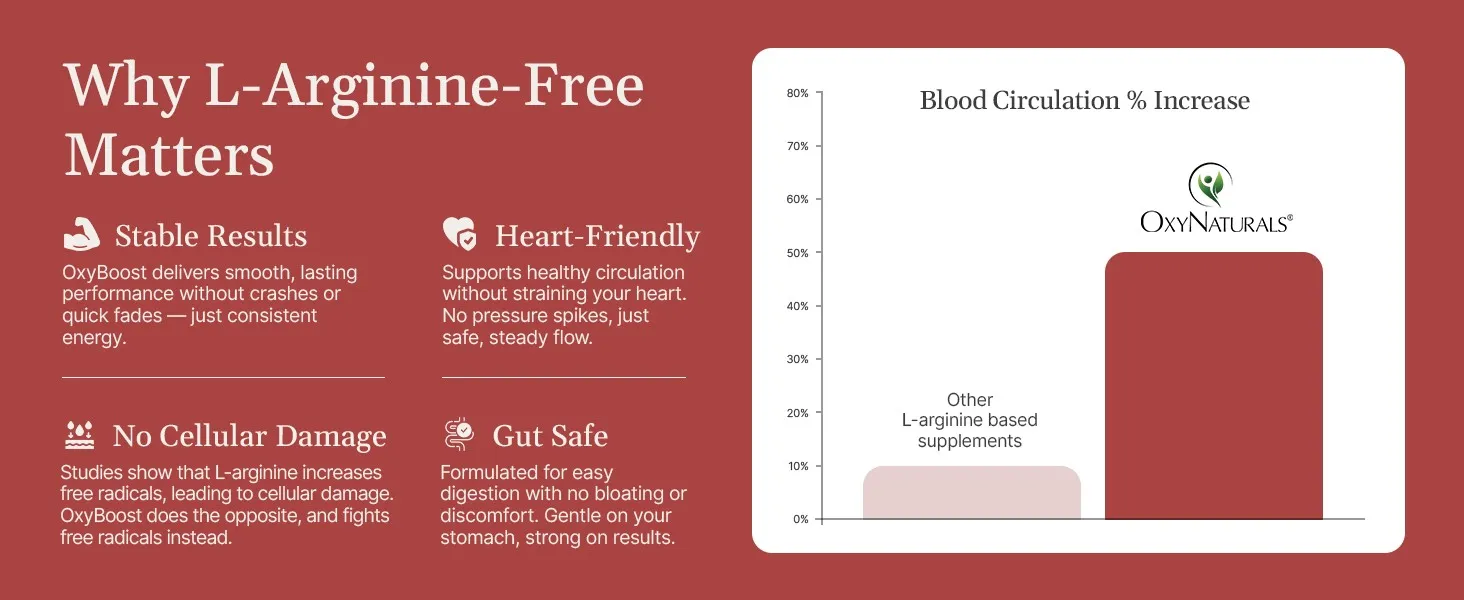
OxyBoost: one story across seven modules.
Each module carries one message, and none of them repeats a listing image. See the full case study.
What the size chart won't tell you.
- Design for the phone first. Most shoppers see A+ on mobile, where a 970 px module shrinks to about a third. If the headline isn't readable there, it isn't readable.
- One module, one message. Hero, what it is, ingredients, benefits, routine, quality. Each module earns the next scroll.
- Don't repeat your listing images. The shopper has already seen them. A+ is where the story continues.
- Make it one scroll, not boxed posters. Matching backgrounds and type let modules flow into each other.
- Answer the doubt, not just the features. Ask what stops the buyer from adding to cart, then show the answer.
- Vary the rhythm. Mix a hero photo, a close-up detail, ingredients, lifestyle and an info layout so the scroll never feels repetitive.